Site refresh: Minimal Mistakes theme
Just a quick post in case anyone is discombobulated by the changes in the website…
I’ve decided to switch to Michael Rose’s Minimal Mistakes Jekyll theme. It’s a fantastic layout and fully supports all the features I need.
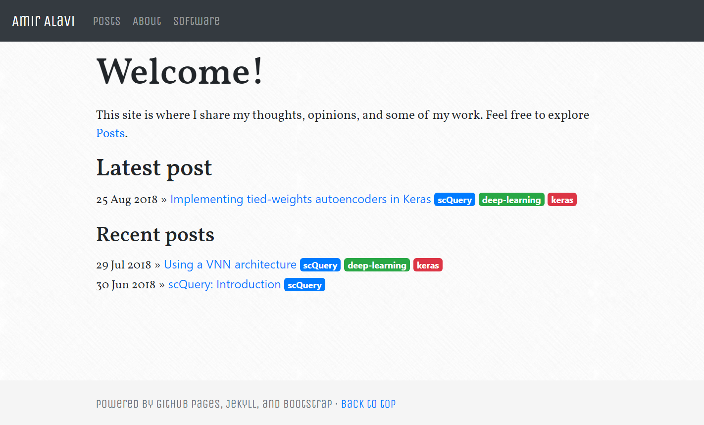
Yes, this means I’ve given up on using my own from-scratch CSS and designs. Here’s what it looked like most recently before the switch:

I definitely think it’s an improvement!
As before, comments on blog posts are enabled through GitHub issues, but this time I’ve become aware of Utterances, an awesome little widget that takes care of setting this up.

Comments